Icons / Illustrations
Car & Classic provides a set of icons and illustrations to bring our UI to life.
Icons
You can preview available icons in the design-kit icons page.
In the codebase, icons live under:
laravel/resources/inertia/assets/icons/
They are used through the <Icon> component:
<script setup lang="ts">
import Icon from '@inertia/views/components/icon/Icon.vue';
</script>

<template>
  <Icon name="spinner" class="animate-spin" size="24" />
</template>
See Icon in Storybook for available props.
Icon Container
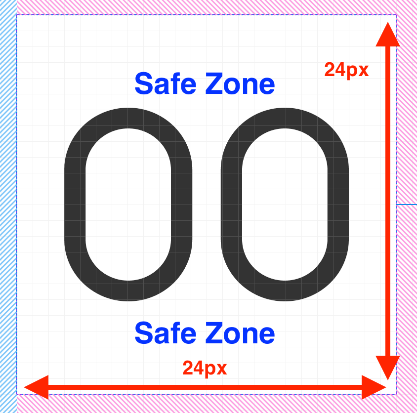
All icons use a fixed 24px container to ensure alignment and consistency, regardless of the icon's shape or visual weight:
Adding a New Icon
- Open the Figma icon page.
- Copy the icon together with its 24px safe zone.
- Optimize the SVG at svgviewer.dev to reduce file size.
- Save it in
laravel/resources/inertia/assets/icons/using the same name as in Figma. - Use it via
<Icon name="your-icon-name" />.
Design Icons
Design icons are larger illustrations found in our Figma design icon section.
They differ from regular icons in the following ways:
- Include background elements
- May use stroke or fill styles
- Can be visually unbalanced (not centered)
Storage Location
Store all design icons in:
laravel/resources/images/design-icons/
If you find similar assets in laravel/resources/images/illustrations/, move them to laravel/resources/images/design-icons/.