Design Kit
In Car & Classic we created a Component Library (UI Kit) to standarize the design and functionality of our components across all our projects.
We called it Design Kit, and it aligns closely with the structure and organization found in the Figma Design Kit.
You can find it in the resources/design-kit directory, in our Storybook, and all across Car & Classic products.
Atomic Design
The design kit is organized according to the Atomic Design methodology thanks to our amazing designers at the Product Team.
This approach is based on the idea that UI components can be broken down into smaller, reusable elements, which can then be combined to form larger, more complex components.
The Atomic Design methodology is divided into:
- System: The Design Kit
- Product: The Application
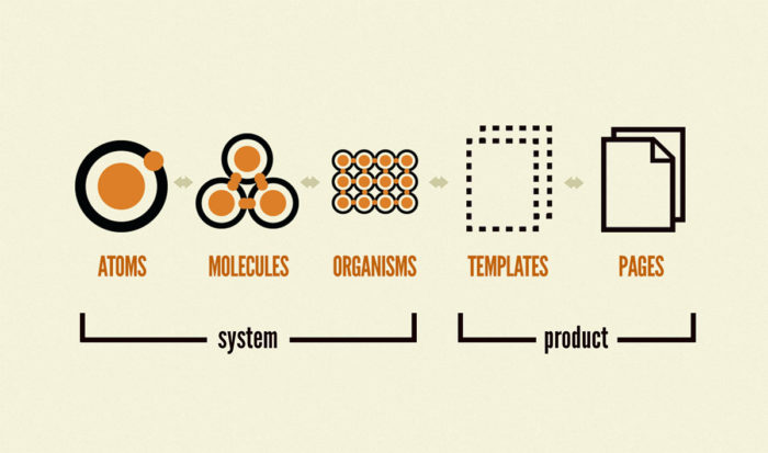
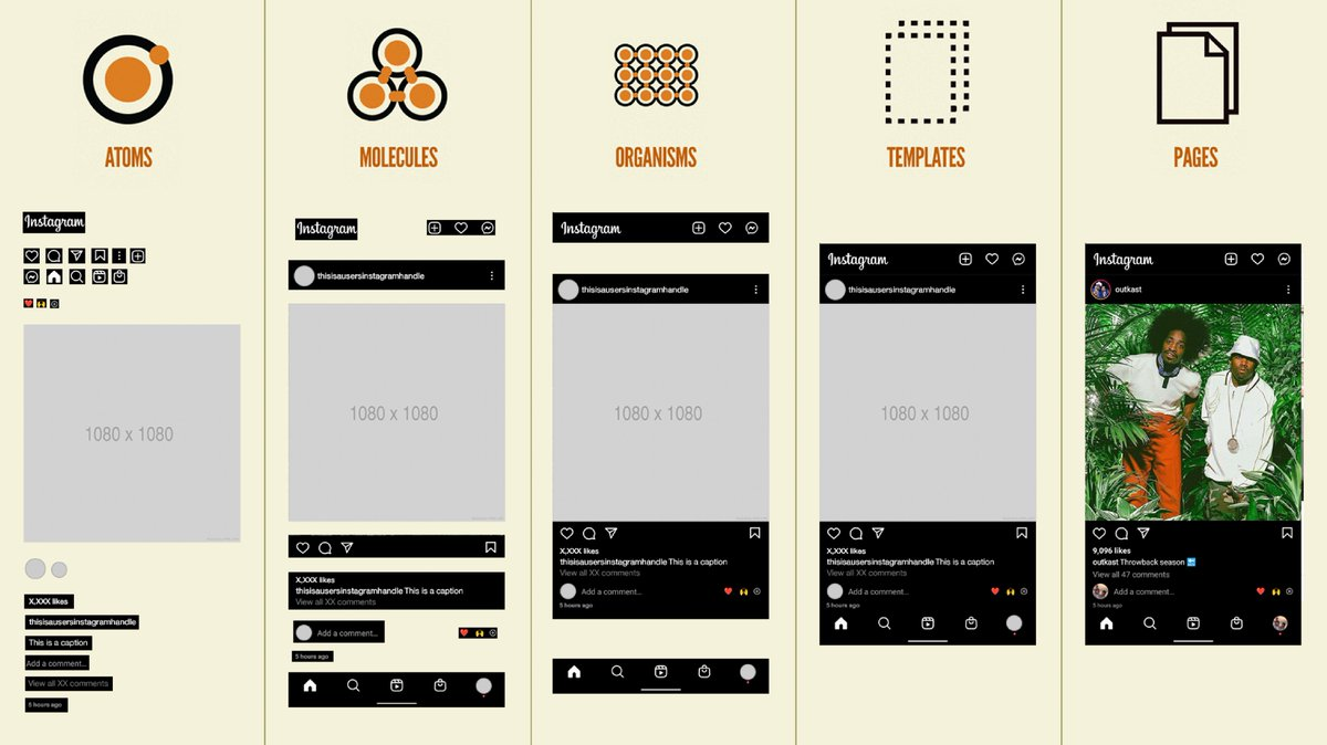
System
The System is the design kit, and it is composed of the following categories:
- Atoms
- Molecules
- Organisms
The System lives in the resources/design-kit directory.
Product
The Product is the application, and it is composed of the following categories:
- Templates
- Pages
The Product is currently spread between resources/js and resources/inertia directories.
Design Kit Alias
For ease of reference and import within our projects, the resources/design-kit directory is accessible through the @design-kit alias.
Directory Hierarchy
The design-kit directory mirrors the hierarchy present in the Figma Design Kit.
This one-to-one mapping ensures that both product team and developer teams can easily correlate between the design source and the codebase, facilitating communication.
The categories for the Design Kit are:
/atoms/molecules/organisms
Naming Conventions for Directories
Directories should use kebab-case and mirror the Figma Design Kit.
All component directories should be prefixed with c- to indicate that they are part of the Component Library, and to avoid naming conflicts with other components.
Examples:
resources/design-kit/atoms/buttons/c-buttonresources/design-kit/atoms/buttons/c-button-icon
Naming Conventions for Files
Vue files and their sibling files (.test.ts and .stories.ts) should use PascalCase to reflect their component nature.
All component files should be prefixed with C to indicate that they are part of the Component Library, and to avoid naming conflicts with other components.
Example:
CButton.vueCButton.stories.tsCButton.test.ts
Naming Convention Examples
The files for <c-button> component would be organized as follows:
@design-kit/atoms/buttons/c-button/CButton.vue@design-kit/atoms/buttons/c-button/CButton.stories.ts@design-kit/atoms/buttons/c-button/CButton.test.ts
The files for <c-button-icon> component would be organized as follows:
@design-kit/atoms/buttons/c-button-icon/CButtonIcon.vue@design-kit/atoms/buttons/c-button-icon/CButtonIcon.stories.ts@design-kit/atoms/buttons/c-button-icon/CButtonIcon.test.ts
Next Steps
Now that you understand the structure and organization of the Design Kit, let's move on to learn about design choices when implementing a component.